Why Many Digital Projects Feel Disconnected

A website, app, or digital platform can look modern and still fail to communicate real value. The problem is often not design or development alone. It is a lack of clarity between business strategy and user experience.
Table of contents:
- 1. Why Many Digital Projects Feel Disconnected
- 2. A Digital Touchpoint Is Never Neutral
- 3. The Most Common Gap: Companies Know Too Much About Themselves
- 4. Good Digital Work Starts Before the Interface
- 5. Modern Does Not Always Mean Better
- 6. The Future Belongs to Teams That Connect Disciplines
- 7. A Better Question for the Next Digital Project
Why Many Digital Projects Feel Disconnected
A lot of companies do not struggle because they lack a website, an app, or a digital platform. They struggle because their digital presence does not clearly translate who they are, how they work, and why clients should trust them.
This is especially visible in service-based businesses, creative studios, consulting firms, recruitment companies, real estate brands, education providers, and B2B companies. From the outside, the problem often looks simple.
- “The website feels outdated.”
- “The app is hard to use.”
- “The brand does not look professional enough.”
- “The platform is missing features.”
- “The user journey is confusing.”
But these are usually symptoms. The deeper issue is that many digital projects are treated as production tasks, when they should first be treated as translation work.
- Translation from business strategy to user experience.
- Translation from internal knowledge to public clarity.
- Translation from ambition to structure.
- Translation from visual identity to trust.
- Translation from operations to product logic.
When this translation is weak, the final product may still look acceptable. It may even look modern. But it will feel disconnected. And users feel that quickly.
A Digital Touchpoint Is Never Neutral
Every digital touchpoint says something about the company behind it.
- A homepage tells people what the business understands about its audience.
- A navigation menu shows how clearly the company organizes its offer.
- A case study reveals whether the company can explain its value.
- A booking flow shows how much friction the business places between interest and action.
- A dashboard reflects how well the company understands its users’ daily decisions.
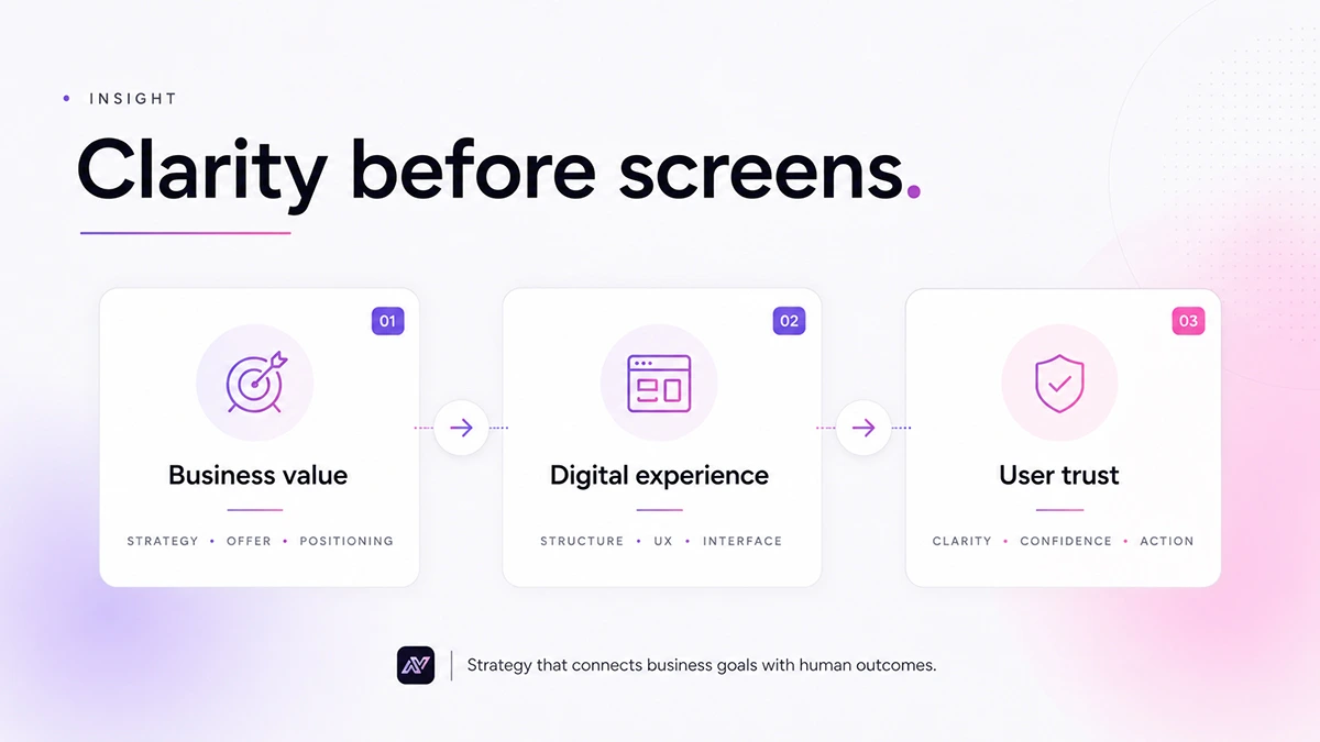
This is why digital products cannot be judged only by design quality or development quality. They need to be judged by the relationship between business intent and user experience.
A beautiful website that does not explain the offer is still weak.
A well-coded platform that does not match the workflow is still frustrating.
A polished brand identity that does not support communication is still incomplete.
The real measure is alignment.
“The real measure of a digital project is not how modern it looks. It is how clearly it translates value.”
AYone Team
The Most Common Gap: Companies Know Too Much About Themselves
One pattern we often see is that businesses underestimate how much context they carry internally.
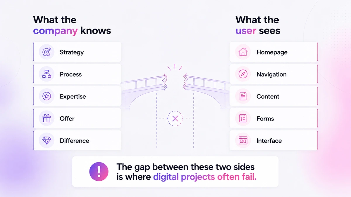
Founders, managers, and teams know the story. They know the service. They know the value. They know what makes their offer different. But the user does not.
The user arrives with limited attention, limited trust, and a specific need.
They are asking simple questions:
- What is this?
- Is it for me?
- Can I trust them?
- What should I do next?
- How much effort will this require?
- What makes this different?
Many digital projects fail because they answer these questions too late, too vaguely, or in the wrong order. This is not only a copywriting issue. It affects structure, hierarchy, visual rhythm, content strategy, interface behavior, and technical decisions.
For example, a creative studio may have strong work but weak project presentation. The visitor sees images, but does not understand the process, the level of service, or the type of client the studio is built for.
A recruitment company may have a strong methodology, but if the website looks generic, the market may perceive it as another standard hiring service.
A B2B platform may have useful features, but if the dashboard does not reflect how teams actually prioritize work, adoption becomes harder. In each case, the problem is not simply design or development. The problem is translation.
Good Digital Work Starts Before the Interface
There is a temptation to move quickly into screens. This is understandable. Screens feel concrete. They create momentum. They are easy to react to.
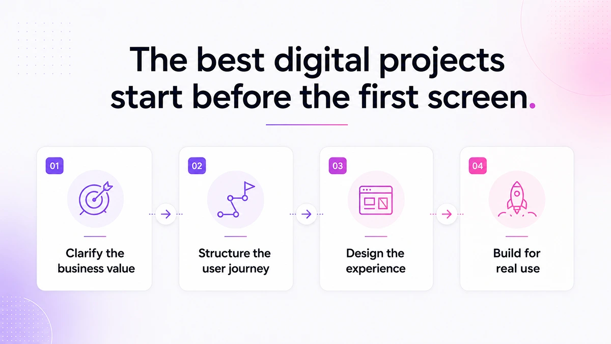
But strong digital products usually need a short phase of clarification before design begins. Not months of abstract strategy. Not endless workshops. Just enough clarity to answer a few important questions.
- Who is this really for?
- What decision should the user make?
- What trust signals are missing?
- What should be explained visually?
- What should be removed?
- What is the business trying to make easier?
- What should the user feel after the first interaction?
These questions shape the interface more than colors or animations. They influence what appears first on a page, how services are grouped, how content is written, how forms are structured, how case studies are presented, and how the development team thinks about flexibility for future growth. When this thinking is skipped, teams often compensate later with revisions.
More sections.
More text.
More pages.
More features.
More decoration.
But adding more rarely fixes a lack of clarity.
Modern Does Not Always Mean Better
Another challenge in our industry is the overuse of “modern design” as a goal.
Modern can be useful, but it is not enough.
- A law firm does not need to feel like a SaaS startup.
- An interior design studio does not need the same structure as an e-commerce brand.
- A consulting company does not need to explain itself like a mobile app.
- A recruitment platform does not need to copy every visual trend in tech.
The right digital direction depends on positioning, audience expectations, buying behavior, and the level of trust required before someone takes action.
- Sometimes the right answer is a bold visual system.
- Sometimes it is a calm, editorial experience.
- Sometimes it is a functional platform with almost no visual noise.
- Sometimes it is a landing page that does one thing very well.
The mistake is assuming that digital maturity has one look.
It does not. Digital maturity is when the experience feels intentional, coherent, and useful for the people it serves.
The Future Belongs to Teams That Connect Disciplines
The strongest digital projects are rarely created by design alone or development alone.
They happen when strategy, UX, content, visual design, and technology are connected early. This matters even more now because clients expect more from digital work.
They do not only want something online. They want systems that support credibility, sales, operations, hiring, communication, and growth. That is also why the way a digital team is structured matters.
At AYone, we approach digital projects through this connection between disciplines. A website is not only a visual interface. A mobile app is not only a set of screens. A platform is not only a technical build. Each project needs the right balance between business understanding, user experience, visual direction, and reliable development.
This does not mean every project must be complex.
In many cases, the best solution is simpler than expected.
- A simple website can carry strong positioning.
- A simple app can remove real operational friction.
- A simple dashboard can help a team make better decisions.
- A simple brand system can make communication more consistent.
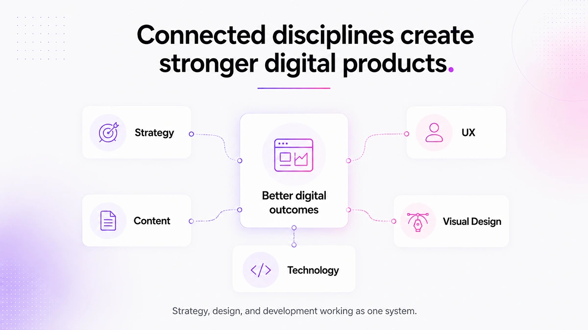
The value comes from knowing what to simplify and what to make stronger. That is where connected teams create better outcomes: not by adding more layers, but by making better decisions earlier.
A Better Question for the Next Digital Project
Instead of asking only:
“What do we need to build?”
Companies should also ask:
“What needs to become clearer?”
That question changes the conversation.
- It moves the project away from decoration and toward meaning.
- It helps teams see the difference between features and decisions.
- It reveals whether the issue is visual, structural, operational, or strategic.
- It creates better collaboration between business owners, designers, developers, and content teams.
Digital projects are no longer separate from how companies are perceived.
They are part of the first impression, the sales process, the hiring process, the client experience, and the internal workflow. When the digital experience is clear, people move with confidence. When it is unclear, they hesitate. And hesitation is often where opportunities are lost.
The companies that will stand out are not necessarily the ones with the most complex websites, the biggest platforms, or the loudest branding. They are the ones that know how to translate their value into experiences people can understand, trust, and use.
That may be one of the most important digital skills today.
What do you think companies underestimate most when starting a website, app, or platform project? Clarity, structure, content, design, or internal alignment?